Cracken Cakes & More Rebranding Concept Design
Design Brief for Ad Slicks
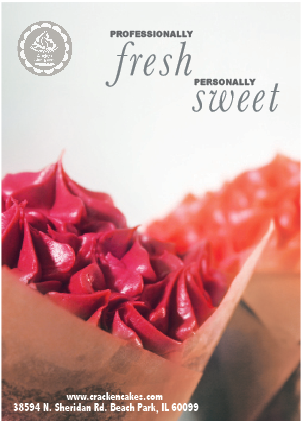
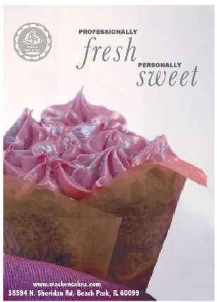
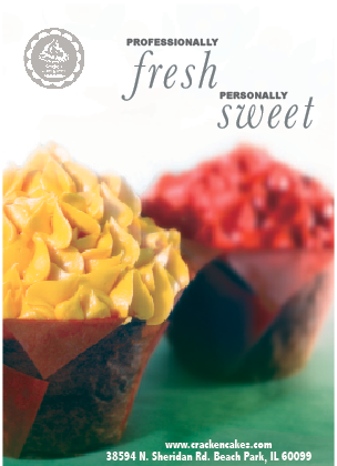
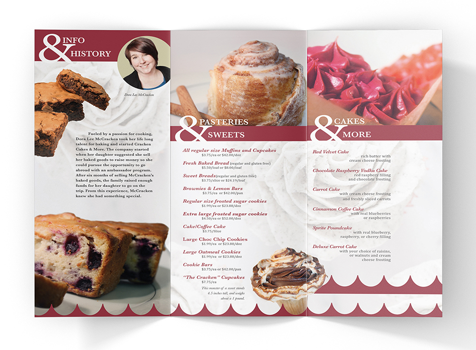
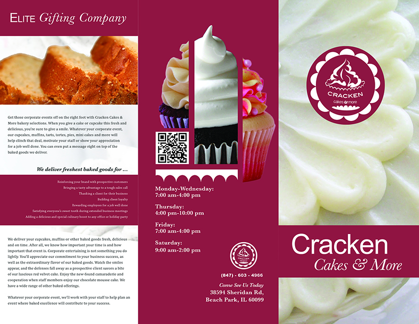
It just didn’t seem right to use photos of baked goods that are not from the client. So the first step of this project was to schedule a photo shoot with my client Mrs. McCracken. This photo session took about three hours to shoot. The next step was to edit the photos in Photoshop to enhance color and do any touch up work to make the pastries look mouth watering. The direction I got from my group was to make the add for the Lake Bluff Magazine the rest was up to my judgment. From our initial consultation Mrs. McCracken seemed to have two target clients, Business to Business and Business to Clients. So I decided to use the phrase “ professionally fresh… personally sweet” these phrases appeal to both of her target audiences. And it supports the fact that she makes a quality product and it will create a positive memory to any who receive a cake from Cracken Cakes & More.

I chose to focus on the cupcake photos because they visually connect with her logo that incorporates a cupcake it its design, that way someone can draw a connection between the articals. Additionally, out of all the products I photographed the pattern and texture in the cupcake frosting is eye catching and lively. I had a several strong photos of different cupcakes so instead of picking one I made a series of ad slicks that could be used threw out the year according to season or holiday. These aren’t made to be specific to any event but designed to be versatile for the client to use them readily. My goal for these ads was to make them market her product year round and to appeal to both of her target audiences and I feel that these designs satisfy both of my intentions.